Creating Unity Between Opposites
Is It Possible to Create Cohesive Flow Between Two Rooms With Different Designs?
Focus Lighting used linear LED fixtures to establish continuity between adjacent, yet differently designed, amenity spaces within a sprawling NYC leisure club.
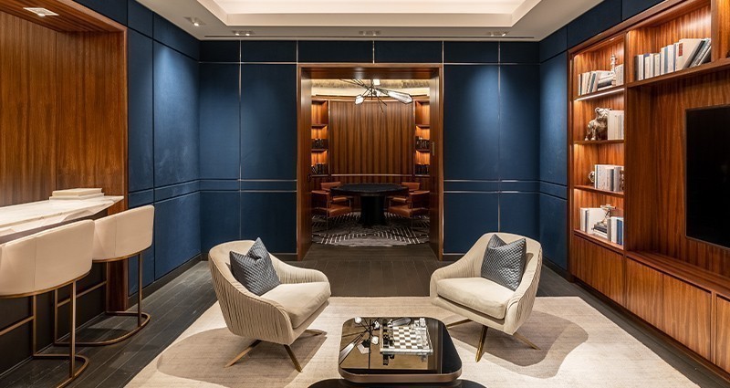
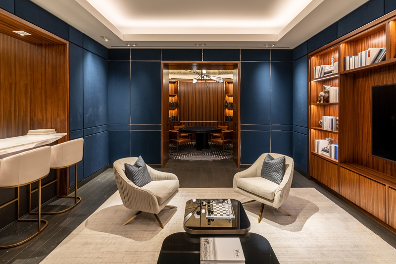
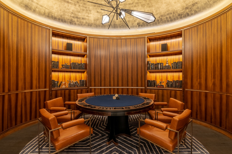
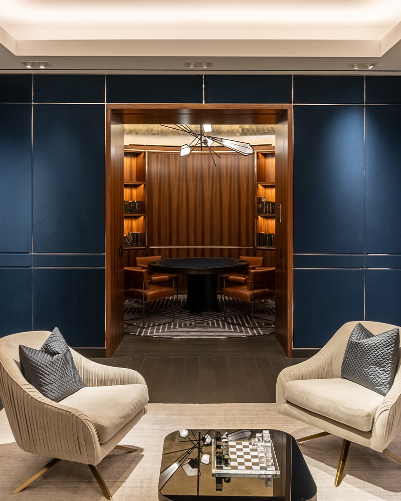
The poker room and adjacent lounge of the Waterline Square, designed by Rockwell Group, could be considered a study in opposites. One room is oval, the other rectangular. The navy used in one space contrasts the warm tone of the wood paneling and gold leaf used in the other. However, a subtle mix of elements create unity, including natural finishes, color, and masterful lighting design.
Photography courtesy of Ryan Fischer Architectural Photography
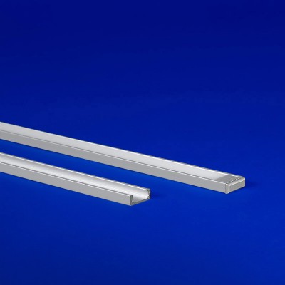
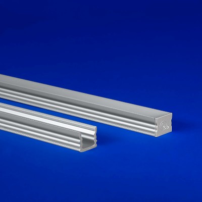
Stephanie Daigle of Focus Lighting, an architectural lighting design firm based in NYC, was one of the designers tasked with using light to create harmony between the two unique amenity spaces. Achieving uniform lighting was a challenge considering the opposing geometry of the environments. The traditional rectangle of the lounge called for linear extrusion profiles, while the oval walls and shelves of the poker room required flexible LED lighting fixtures.
Photography courtesy of Ryan Fischer Architectural Photography
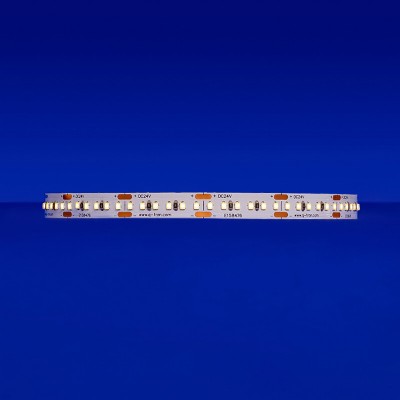
Interestingly, QTL was not the original manufacturer specified; a different product was in the plans. Stephanie shared her delight in having the submittal crossed over to QTL. “It’s not often that a substitute is even better than your original spec.” she said. “The consistency of color, the number of options we have within a single manufacturer – whether it’s the variation of wattages, color temperatures, or all the extrusions we could need. I knew I was going to get strong, quality consistent dimming, not a lot of the inconsistencies you’d typically get from a lower-cost LED.”
Photography courtesy of Ryan Fischer Architectural Photography
Lesser quality LEDs often create issues with consistent color temperature due to lack of tight binning, especially when a mix of rigid and flexible fixtures is being used. The consistency of QTL lighting is achieved by a proprietary process that matches the color temperatures of all the LED tape used on a project, ensuring the delivered CCT is more uniform across all fixtures. This technique ensured harmony between the 2700K rigid SLIM extrusions used in the lounge bookshelves and the Q-CAP fixtures in the shelves of the elliptical poker room.
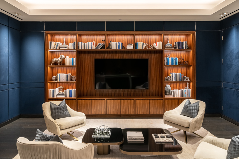
Throughout the lounge space, intricate layers of light emphasize the groove-detail in the textured navy wall panels. Layers of linear coves in the ceiling illuminated by static white tape in TORQ extrusions, repeat the rectilinear geometry found on the walls and lend airiness to the underground room.
Photography courtesy of Ryan Fischer Architectural Photography
A glow emits from the adjoining poker room, guiding the guest’s sightline to the grandeur of the rounded gold leaf ceiling and curved bookshelves. While the tones of the two rooms contrast each other, one cool and the other warm, unifying details of wood, color and warm 2700K linear LED light smooth the flow from one room to the other.
“Consistency in lighting was key,” Stephanie explained.